- All
- Product Name
- Product Keyword
- Product Model
- Product Summary
- Product Description
- Multi Field Search
Views: 129 Author: Site Editor Publish Time: 2024-04-10 Origin: Site
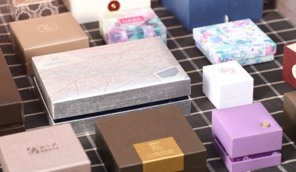
We will introduce the five major techniques for designing box packaging, including box shape, color matching, texture, typography, and functional design. These five techniques will help you design imaginative and creative box packaging that highlights the product. Unique brand image and attract consumers' attention.

1. Box shape
The shape of the box is one of the important elements of packaging design. It can not only increase the beauty of the packaging, but also provide certain additional functions for the product. When choosing the shape of the box, comprehensive considerations need to be made based on different product characteristics and target user groups. For example, for wine products, some classic bottle-shaped boxes will be more distinctive than traditional square boxes; and for portable electronic products, such as mobile phones, power banks, etc., flexible folding box designs will be used to reduce the cost. The size and weight of the small box improve portability. Of course, the box-shaped design needs to satisfy both practicality and aesthetics in order to truly highlight the value and brand image of the product.
When designing the shape of the box, attention should also be paid to matching the size and weight of the product to avoid difficulties in transporting and storing the product due to excessive size or weight. In addition, production process and cost control must also be considered to ensure that the box shape can be realized in actual production.
2. Color matching
The color matching of the box is another crucial factor in packaging design. Different colors can convey different emotions and atmospheres, and can also help products establish a unique brand image and attract the attention of target users. When matching colors, it is necessary to take into account the attributes of the product itself and the positioning of the brand, as well as the cultural background and aesthetic concepts of different user groups. For example, for weight loss products, using fresh and soft colors, such as blue, pink and green, can provide users with a sense of health and comfort; while for high-end cosmetics, black and gold are a classic and atmospheric combination.
In addition, when matching colors, we should also pay attention to the quantity and proportion of the matches, as well as the color difference and the presentation of color effects. A good designer is able to take these details and considerations into consideration and create a color scheme that is moving and visceral.
3. Texture material
The texture material of the box is also a very creative element in packaging design. Different textures, materials and craftsmanship can bring different touches and textures to the box, increasing the beauty and artistry of the box. When choosing the texture material of the box, you need to choose it based on the attributes of the product and the target users. For example, for high-end wines and luxury goods, the use of high-end satin and glossy materials can increase the grade and luxury of the product; while for children's toys and gift boxes, the use of cartoon images and friendly feel can bring a more premium feel to the product. Much fun and affinity.
In addition, there are more complex texture design and processing technologies, such as laser engraving, embossed printing, UV ink and special decal technology, etc. These technologies can help designers achieve more detailed and rich pattern effects and three-dimensionality. feel.
4. Font typesetting
Typography is an often overlooked element of packaging design. Different fonts, font shapes and sizes can convey different emotions and styles, and can also highlight the product name and features, improving the recognition and impression of the packaging. When selecting fonts, you need to consider the suitability and readability of the fonts, as well as their coordination with the entire packaging design. For example, on the premise of ensuring readability and aesthetics, try to use simple and easy-to-impress font effects to avoid too many complex glyphs and image materials.
Another key to typography is text structure and layout. Depending on the product name and description, designers need to flexibly use different typography methods and structural layouts to increase the beauty and design of the packaging. Common layout structures include center alignment, left alignment, right alignment, alignment, etc. In addition, visual effects can be added through illustrations, graphics and animations to add more fun and cultural connotation to the box.
Combining the above four aspects, we can see that box packaging design is a very complex and comprehensive task. Designers need to strive for excellence and grasp every detail and factor to truly realize the concept and value of the product. At the same time, it is necessary to maintain communication with customers at all times during the design process to continuously optimize and improve the design effect.
Summary: The above introduces the five major tips for designing box packaging, which are box shape, color matching, texture material, font layout and functional design. These skills are essential elements in the box packaging design process, which can help designers achieve unique product images and brand images, and highlight the value and characteristics of the product. I hope it can be helpful to those engaged in the packaging design industry, and I also hope that more companies will pay attention to the aesthetic and cultural connotations of packaging design.